Picture: Netflix / Retuers
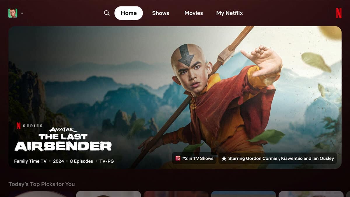
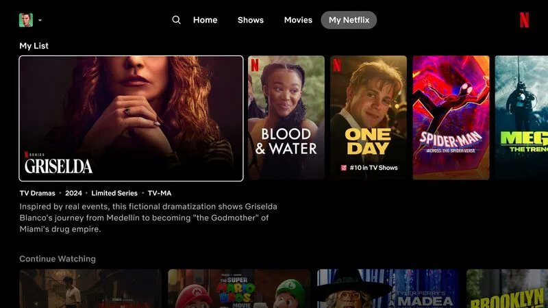
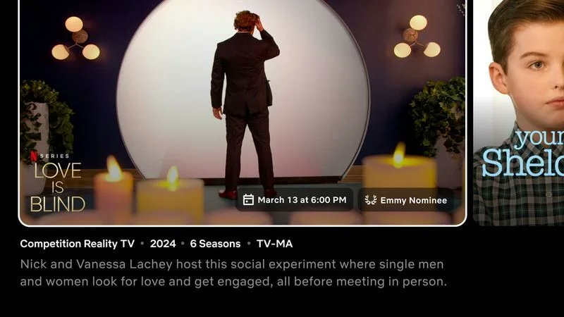
Over the past month, Netflix has been testing its big user interface overhaul on TV apps for a select group of users, and early feedback hasn’t been exceptionally positive.
Reuters reported the first look for the redesign in June 2024, although all versions of that story have been deleted except some syndicated versions, like the one that still resides on NYPost. We don’t know whether Netflix requested the story be taken offline.
In that article, Netflix executive Pat Flemming said, “We really wanted to make that simpler, more intuitive, everything easier to navigate.”
Picture: Reuters / Netflix
Netflix discussed the overhaul in some depth during its recent Q2 earnings call. The co-CEO of Netflix, Greg Peters, discussed some of the changes that will be rolling out onto Netflix, why they’re occurring, and more.
Greg emphasized the structural improvements rather than the immediate benefits. He highlights the need for a flexible framework to accommodate various content types and evolving user needs.
Peters explains that many of the changes are coming as Netflix expands into different types of programming, “A lot of this is getting to the increase in diversity of entertainment that we are now offering.” He mentions incorporating live events alongside traditional film and series content, such as the Tom Brady Roast and WWE beginning 2025. The goal is to make it easy for users to access and engage with diverse content types, including games.
He anticipates that the new structure will deliver long-term benefits in user engagement, retention, and revenue, noting, “Our expectation is that this new structure will allow us to deliver, as the old structure did for a decade, multiple repetitive material benefits to users.”
Picture: Reuters / Netflix
From what we’ve seen, the rollout started as early as last month, and early reviews haven’t been very kind.
Eric Italiano, a senior writer for BroBible, noted the changed design in a now-deleted X video and wasn’t particularly impressed. He said he was surprised that they’ve changed the UX, which “everyone agreed was their best in the business, and now it’s like Hulu and impossible to navigate.”
Italiano’s biggest complaint was that there was significantly less content visible at any given time, concluding, “It makes the very famed act of Netflix scrolling infinity more difficult.”
Italiano isn’t the only one who’s not been a fan; we’ve spotted numerous people across social media who have been given the new UI. NaiMarts on X said, “Netflix’s new design on the fire stick is so ugly I hate it.”
On Reddit, there was a post last month where numerous users railed against the changes with one saying, “I just got it too and I hate it. The titles takes up the whole screen. Before you could see like 10 movies at once but now only 2-3 because it’s so oversized. This is ridiculous. Who would like this?? I have no idea how this was given the green light.”
In another thread, one user stated they’re using Netflix on their phone rather than using their TV now, saying, “I hate the new style too. I’m actually using my phone app because it’s more like the old style to look around Netflix and find what I’m after and want to watch. I then pick what I’m going to watch and start it for a couple of minutes. I go back to my TV and find my continued watching to watch it. I absolutely hate their new home screen.”
Netflix’s TV app isn’t the only one that has been overhauled recently. The Windows app recently changed to be more in line with Netflix’s web version, and complaints have come regarding some of the downgrades, such as the ability to download for offline play and the removal of picture-in-picture.
Have you received Netflix’s UI overhaul on TV devices yet? Do you like it? Let us know in the comments.


