Picture: Netflix
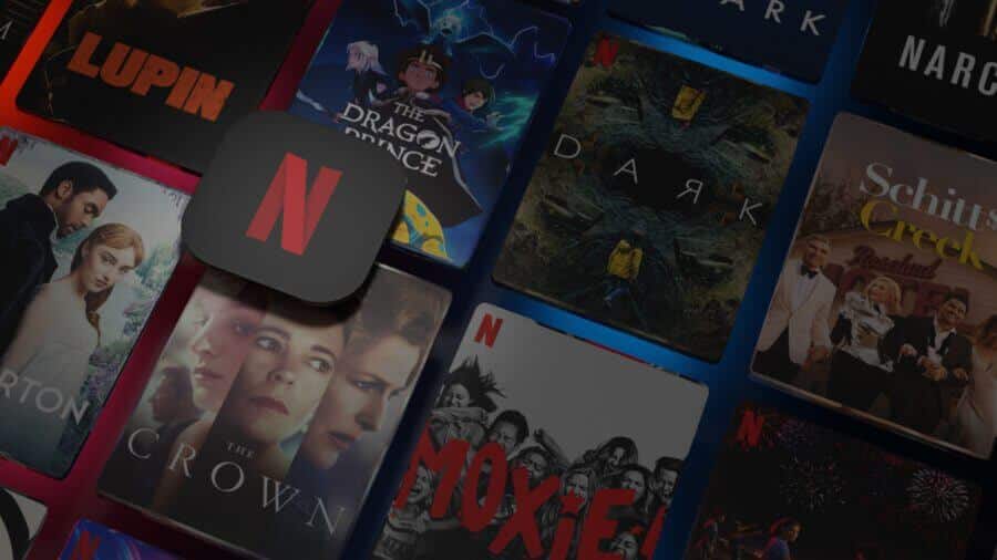
Netflix within the next year will likely surpass 2,500 Netflix Originals. They already make up a significant portion of the library (almost 40%) but are we getting to the point where a Netflix Original label is so broad that it’s actually unhelpful? Here’s why Netflix should be leaning in on the brands its social media teams have crafted.
This is something anyone following me over on Twitter will know I’ve been advocating for quite some time but what really got me was a tiny throwaway line in Bloomberg’s excellent Screentime newsletter. Lucas Shaw was listing through his favorite streamers and ended the list with “I find myself completely lost on Netflix.”
This struck me as I even find myself saying that when booting up Netflix. Most of the shows you’re confronted with are brand new Netflix Original titles that you’ve almost certainly never heard of before.
There’s a constant barrage of criticism at Netflix for burying or underpromoting its shows and to some extent, Netflix can’t do much to stop that. There’s only so much marketing you can do and Netflix’s big strategy is to fill the genre and content gaps left by content it’s traditionally licensed.
So how does it stem this problem or fix it? Inside the application, we believe Netflix should start using the brands it has built on social media and YouTube to pool certain types of content to make it much more easily identifiable.
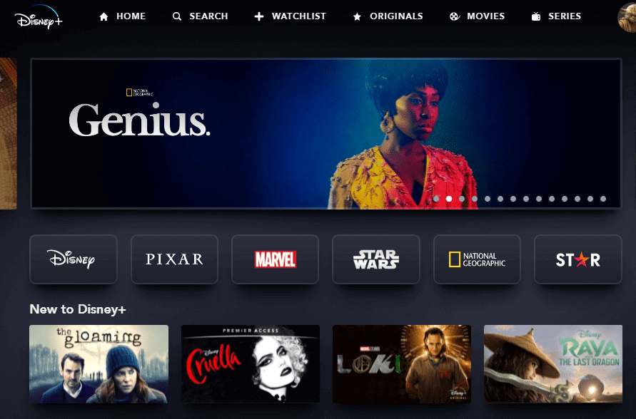
How this would work in practice is something all the new kids on the block have been doing well. Look at Disney or HBO Max when you first jump in. You’re confronted not by a single title and then an endless sea but you’re often presented with top-level categories and then sub-brands that they own.
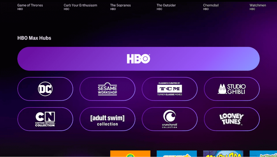
HBO Max allows you to filter through AdultSwim, TCM, Cartoon Network content for instance. If you click AdultSwim, you almost certainly know what you’re in for. Likewise, if you hit Cartoon Network, you not only know what sort of content you’re going to be confronted with but instantly know whether it’s going to be aimed at you.
- Disney Plus Internal Brands
- Hbo Max Internal Brands In App
Disney+ has this to some degree too with its various top-level brands but Paramount+ and HBO Max nails this (even if the rest of their streaming apps really leave much to be desired).
What social brands does Netflix have?
Quite a few.
We’ve documented how well Netflix’s kid’s efforts on YouTube have been which all lean on independent branding besides just being Netflix content.
It’s got brands such as the rather generic Netflix Anime, Netflix Futures (for its teen content), Netflix Is A Joke (for its comedy content), its Strong Black Lead accounts, its Most account (for LGBT content), Con Todo (for Spanish language content) and so many more.
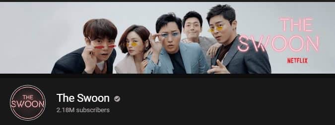
Swoon Brand on YouTube
Perhaps one of the biggest is Netflix Geeked, which was recently rebranded back in April 2021. They’ve made themselves the home to all things “geek” (which is quite a broad term in the modern day, but you catch my drift).
How would this work in practice?
Honestly, it wouldn’t be a massive stretch just expand Netflix’s collections, tweak the UI, add branding to the title tiles, and expand views appropriately.
Various searches on Netflix now allow you to browse collections where they’re available. Navigate to Breaking Bad on your TV, and you’ll be presented with the option to browse the Breaking Bad collection. A Black Lives Matter collection was made available in the app last year, too. Similarly, if you type in Shonda, you get a nice Shondaland Collection banner with all her content in one place.
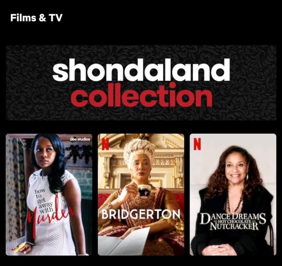
Shondaland Collection Banner on Netflix App
You could create dedicated logo stings when titles first begin streaming. Netflix’s anime channel videos feature a great sting. Again, it re-emphasizes the subbrand and makes everything look a little more unique.
Having the various social brand logos in addition to or in replacement of the Netflix “N” that’s present on many titles would help instantly distinguish who the title is for and whether you might like it or not.
Then, imagine creating different tiers of movies. Some of Netflix’s biggest blockbusters and award contenders could be presented with a gold Netflix logo “N” on their title tiles, with the entrance animation replacing the traditional ta-dum with the epic Hans Zimmer extended theme, which has been held back thus far for theatrical showings.
And just going one step beyond for a second. Even leaning into your internal studio brands would be great. Picture this: a light blue background appears with a jumping lamp pouncing across the screen. You know instantly what I’m talking about, don’t you? The Pixar intro.
Netflix Animation is building some impressive teams and giving them the opportunity to have a Netflix logo sting, which they stylize, whether in their show’s art style or however they see fit, which would add character and make individual titles unique and memorable.
In our view, all of this creates a better experience on Netflix and does a better job of helping to build your overall brand and, most importantly, separate and distinguish your content.
Best of all, the hard work has seemingly already started.
What do you think? Should Netflix lean in on its subbrands created on social media? How would you help shows stand out on the app? Let us know in the comments.

